

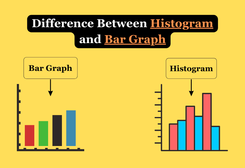
Histograms and bar graphs are two common types of statistical charts used to visualize data. Though they may look similar at first glance, some key differences exist between histograms and bar graphs. The main difference between histogram and bar graph is that a histogram groups numbers into ranges and displays the frequency of items in each field, while a bar graph compares individual values. In a histogram, the x-axis represents a range of numerical values, and the y-axis represents frequency.
The bars in a histogram touch each other to display a continuous distribution. In contrast, a bar graph has gaps between the bars to compare individual values along the x-axis. The y-axis of a bar graph represents the actual values for each x-axis category.
Key Difference Between Histogram and Bar Graph
Grouping of Data Points
- Histograms group data into ranges or bins and display frequencies of items in each bin. The bins have equal widths.
- Bar graphs group data into distinct categories and display frequencies or values for each category. The bars can have unequal widths.
Type of Data
- Histograms visualize the distribution of numerical data, which is often continuous.
- Bar graphs visualize categorical or discrete data. The data is divided into distinct groups.
Bars Touching
- Histogram bars touch each other to display a continuous distribution. There are no gaps between bars.
- Bars in a bar graph are spaced apart from each other. Gaps between the bars separate each category.
Axis Labels
- The horizontal x-axis of a histogram shows the data value ranges or bins.
- The horizontal x-axis of a bar graph shows the distinct categories, groups, or labels.
Uses
- Histograms help visualize distribution shapes, central tendency, and spread of numerical data.
- Bar graphs make it easy to compare values or frequencies across different categories or groups.
When to Use a Histogram vs Bar Graph
Use a Histogram for:
- Continuous or numerical data like times, weights, and temperatures.
- Seeing the overall distribution, shape, and spread of a data set.
- Uncovering patterns, clusters, gaps, outliers, skewness, etc.
Use a Bar Graph for:
- Categorical, discrete, or qualitative data like genres, brands, and survey responses.
- Comparing amounts or frequencies between different groups or categories.
- Highlighting rankings or changes between groups.
Histogram vs Bar Graph – Comparison
| Basis For Comparison | Histogram | Bar Graph |
| Data Type | Numerical, Continuous | Categorical, Discrete |
| Data Representation | Frequency of values within numerical bins | Frequency or values within distinct categories |
| Bins/Categories | Continuous ranges (equal-width bins) | Discrete, non-overlapping categories |
| Bar Touching | Bars touch each other, no gaps between them | Bars spaced apart, gaps separate categories |
| X-Axis | Represents value ranges or bins | Represents categories or labels |
| Y-Axis | Represents frequency or count | Represents frequency or value |
| Use Cases | Visualize distribution, central tendency, spread | Compare values or frequencies between groups |
| Data Continuity | Shows continuous data distribution | Displays data as separate categories/groups |
| Common Examples | Exam scores, temperatures, time intervals | Sales by product, survey responses, age groups |
| Visual Shape | Bell-shaped (normal distribution) or skewed | Bars with varying heights |
| Analysis Focus | Distribution characteristics, patterns, outliers | Comparisons, trends, rankings |
Histogram vs. Bar Graph Examples
Histogram Example
Bar Graph Example
Frequently Asked Questions
When should you use a histogram versus a bar graph?
Use a histogram for continuous, numerical data to see distributions. Use a bar graph for discrete, categorical data to compare values across distinct groups.
Can histograms and bar graphs display time series data?
Yes, both histograms and bar graphs can show time series data. The bars would represent time periods like months or years rather than numerical ranges or categories.
What are good examples of histogram and bar graph datasets?
Histogram data: Incomes, home prices, test scores, patient wait times.
Bar graph data: Movie genres by ticket sales, brand awareness by age group, and survey responses.
How do you determine the number of bins or bar width in histograms and bar charts?
For histograms, select bin widths that provide sufficient detail without too many sparse bins. For bar charts, adjust bar widths to highlight comparisons across categories. Balance white space between groups.
Conclusion
Though similar in using rectangular bars, histograms, and bar graphs display different types of data in unique ways. Histograms visualize the distribution and shape of numerical data, while bar graphs allow you to compare values across distinct categories or groups. Use the right chart type for your data based on whether it is continuous vs. discrete. Both histograms and bar graphs can provide insightful views of data when created properly.